The Image + Text Theme Block gives you a layout for an image, title and a brief paragraph or two of text.
Image + Text Block Guidelines
- Use the Image + Text block mid-page to introduce new subject matter. This block is also a good option to use at the top of a page using the Theme Blocks Template.
- Follow all Image and Media Requirements and Best Practices.
- Review the Recommendations for Accessible Theme Blocks page to learn more about requirements for headings, images, and links published in this block.
- Use of this block for an undocumented purpose or in a non-standard way is discouraged and may not be supported.
How to Configure the Image + Text Block
- In the block editor, click on the blue box with the plus sign located at the top left of the page. The alternative text for this link is called “toggle block inserter”. This will open a menu of available blocks to select from.

- A list of blocks sorted into 6 groups will be displayed. Scroll down to the group called THEME and click on the block called Image + Text. This will add the block to your page.
- Each block comes with its own toolbar that appears on top of the block. The buttons change depending on the block you are editing. This is what the Image + Text toolbar looks like:

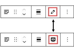
- Note: To move your block text fields from the narrow right column to the middle of your editor, go to the block’s toolbar and click on the pencil icon. This will move the fields to the middle of the page. If you want to preview the page as you are building it, click on the monitor icon and the text fields will move back to the right side of the editor. You can toggle between these two options.

Content Fields
- Title: This is a text field. Content entered here will appear as the block header text. Long words can be allowed to wrap by using a hyphen.
- Accent Title: (Optional) This text appears in a smaller font above the block’s title.
- Description: This content will display beneath the block title. It should be kept brief for design purposes.
- Image: Select your image from the Media Library. Optimal image size is 664px x 664px.
- Call to Action Link: (Optional) If you include a call to action, type the URL, and add a label which becomes the link text.
Settings Fields
- Title Size: Defaults to Normal.
- Layout: The default layout has the image on the left. Choices are Left Aligned Image or Right Aligned Image.
- Background: The default background color is white. The choices are white, orange, blue, or grey. This selection extends full browser/screen width behind all panel content.
- Heading Size: The block title will appear on the page as H2. Do not change this to H1 unless otherwise directed.
- Add Top Padding: Defaults to Yes, which means there is the standard empty space above the block. You can change option to No if you want less empty space, but the recommendation is to leave it set to Yes.
- Add Bottom Padding: Defaults to Yes, which means there is the standard empty space below the block. You can change the option to No if you want less empty space, but the recommendation is to leave it set to Yes.
Can introduce new subject matter
Example Image + Text Block
This is the description area of the Image + Text Theme Block. For design purposes, keep this text brief.