Buttons Block

The Buttons block provides the ability to add clickable buttons to your posts or pages, enhancing user interaction and directing visitors to important actions or links.

How to Add a Button

There are several ways to add a block to your page. The two easiest ways are as follows:

  1. Type / to choose a block:  In the field where it says those words, type a backslash and a pop-up will display a shortlist of popular blocks. Click on the Buttons block and it will appear in the Content Area in the middle of your page.
  2. Click on the Block Inserter: In the top toolbar, click on the square blue icon with the plus sign. This will open a panel to display all blocks. Select the Buttons block and it will appear in the Content Area in the middle of your page.
Top navigation for new gutenberg page editor identifying the toggle block inserter.

This is what the Buttons block and toolbar look like when added to your page:

Buttons block and toolbar

Click into the button field to “Add text…” and start typing the text for your button. Avoid typing “click here” or “learn more”. The link text should be descriptive so the user knows what to expect when they click on the button. Do not use the URL itself as the link text.

Linking the Button

  • To add a link to your button, click into the button text to reveal the toolbar.
  • In the Button toolbar, click the link icon.
  • A pop-up box with a field will display and you can either type a keyword into the field to search for your website link; type the full URL for the link into the field; or paste a URL into the field. When you are done, click the word “Link” and your link will be added to the button.
  • After the button is linked, the Link icon has a slash through it indicating that is what you click on to break the link.
  • To edit the link click on the pencil icon and a pop-up will display, providing the ability to make edits.

Formatting and Styling Buttons

  • Select the Buttons block in the Content Area to reveal the block toolbar.
  • Use the toolbar to justify the buttons left, center, or right. The alt text for the justification icon is “Change items justification.” Please only use the a) single button icon, b) the drag icon to move the button up or down, c) the change items justification icon, and d) the link icon to modify your buttons. You can use the options icon (3 dots on far right) to delete or copy your block.
Buttons toolbar with change justification icon highlighted

There are 2 options to style your buttons. For both options, first select the Buttons block in the Content Area to reveal the block toolbar:

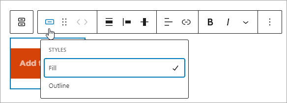
(1) The Buttons toolbar has two button icons. The first double button icon is the “Parent Block” for the button – it’s just a grouping mechanism. If you click on the second single button icon it will display a pop-up for styles allowing you to select Fill or Outline style.

Button Block toolbar, clicking on single button makes button styling option display.

(2) In the right sidebar of the block editor, the Block tab will be displayed. Within the block tab there are 2 additional tabs for Settings and Styles. Under Settings there is an option to modify the width of the buttons. Please do not modify the width. The Boise State website Theme manages button width. Under the Styles tab there are multiple options to modify buttons: (1) Fill and Outline – you can modify your button style to use Fill or Outline; (2) Color, Typography, Radius – please do not use these additional styles for your buttons. The Boise State website Theme manages the styles for buttons in accordance with Brand standards.

The following image shows the style options just referred to. The options that are not allowed are crossed off.

Button block sidebar showing styles
Changing width settings on the Button block is not allowd. Changing Color, Typography, and Shadow options are also not allowed.


Video: Adding Hyperlinks

The following video is a tutorial on how to add hyperlinks to your content through Paragraph and Button blocks blocks. Closed captions are available and a text transcript is also provided following the video.

Video Transcript: Adding Hyperlinks

Adding hyperlinks to your content is easy when you use the insert link button or the keyboard shortcut control+ K. Within your text content select the text you want to make a hyperlink and highlight it. You can either select the link button or use the keyboard shortcut control+ K . Paste your URL in the dialogue box that opens and select apply. If you select the hyperlink that’s been added to your content, you can access additional options using the edit link. Advanced options include open in a new tab, search engines should not follow this link mark as no follow or this is a sponsored link or advert mark as sponsored. Select which options you need and select save. You can also add a stylized link that looks like a button using the button block. To add a button block select the add block button and search for button. Add your text to the button that appears on the page and select the text, and then select the link button from the toolbar. You can also use the keyboard shortcut control+ K. Paste your hyperlink into the dialogue box and hit apply. You can also access the advanced options using the edit link button to open in a new tab or to mark as no follow. If you are using a theme block you have the option to add call to action links to those fields as well. Select add block or the toggle block inserter button and locate the theme block you want to add. For this example I’m going to select image and text. After I select the edit option, I have the ability to ‘select a link.’ Anywhere in the theme blocks that this select link option is available you can add a URL and Link text to create a stylized link in your theme block and it will appear as a stylized button on the page. Make sure you follow all recommendations for the theme blocks as listed on Webguide.