- Accent Title: Add an optional accent title. Note that the accent title is not a heading and should be used for supplemental information, like a tagline.
- Title: Add the name of your website (department, center, college, etc.) to the Subheader Title field. This text will populate the main header at the top of the page and will be the Heading 1 for the page.
- Title Resize: Use this option if the Title includes a long word (12+ characters) that does not fit into the available space on smaller screens. Although this feature will be necessary for some departments and programs, it can impact page load time and site performance if used unnecessarily. This option should be left unchecked unless the Title includes a 12+ character word that exceeds the available space.
- Body Copy: This is an optional field for adding text content below the Title. If you want to briefly describe your purpose, mission, call to action, etc., here’s where you add it. For best results, don’t use more than 20 words. HTML lists are not supported in the Body Copy.
- Button Link: This is an optional URL field for a link in your header, so you can add a button for a call to action in your header section. This field requires a full URL to pass validation (ex. https://www.boisestate.edu). The page will fail to save/update if the address isn’t typed correctly.
- Button Label: This is a text input field for the button label.
- Media Type: Select “Image” or “Video Embed”.
If you select “Image” the recommended image size is 1300px x 687px. The selected image will appear in the left side of the two-column layout for the header. Please note that alt text is required for the Subheader image. If you select “Video Embed”, add the link to your video. (For example, if the video is hosted on YouTube, paste the “Share” link here.) Add an optional video thumbnail image to display before the user plays the video. For best results, keep the Body Copy brief when using the Video Embed option. If no media is selected, the Section Label and Title will be placed in the left side of the two-column layout. - Video Play Button Label: Enter a title or brief description of the video to display as link text.
Note: Heading 1’s are handled differently using the Section Main Page template. The Title text will be used as the Heading 1 (H1) for any page using the Section Main Page template.
Note: Forms should not be used in the subheader section because there is not enough contrast between the background and the form field descriptions. Forms should go in the page content areas only.
Theme Block Template
WordPress Blocks are the components you place into the WordPress Block Editor to build your page or post content. When you add a block to your page, the “block inserter” categorizes the blocks into 6 groups: Text, Media, Design, Widgets, Theme, and Embeds. The blocks grouped under “Theme”, are custom blocks that were created for the Boise State WordPress theme (they were formerly known as “Panels”).
The Theme Block Template is a specific page layout that will not display your site’s title or breadcrumb navigation at the top of the page.
This template is meant to be used when you only want to display theme blocks, and no other type of block, on your page. When selecting this template, consider your audience and the goals for your site to determine if you want to use this type of display, or if your audience will be better served by using the standard default template with heading and paragraph blocks. Please note, you can always add a Theme block to the default template display along with other content that uses paragraphs and header blocks. Using the Theme Block Template restricts blocks to just the type of block categorized under Theme in the block inserter.
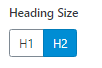
With regards to the Theme Block template, because the title is not displayed, the first Theme block placed on the page requires a “Settings” modification. To do this you open Settings for the block and click on H1 to change the heading size from an H2 to an H1. This screenshot is what the heading size option looks like:
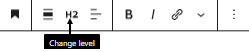
How to get to Settings: When you add a Theme block to your page, the WordPress page editor provides 2 areas to modify: Content and Settings. The Content area is viewable by default. To open Settings, click on the dropdown arrow for Settings in the page editor.
Creating Accessible Pages with the Theme Blocks Template
The title of the first Theme Block on the page will be used as the Heading 1 (H1) for pages using the Theme Blocks Template. Be sure the title of the first Theme Block is an accurate representation of the content on the page. Keep in mind, certain Theme blocks have additional heading styles built in that could affect the heading order and usability of the page. Please review the table for additional accessibility information for using Theme Blocks in the Theme Blocks Template.
Editorial Page Template
This page template allows you to choose a Featured Post to appear at the top of the page. This template contains a Featured Post section with a dropdown that pulls all local site Posts as options for display. The featured image for the post will be displayed in the header area at the top of the page, and is followed by any block content added to the page.
The Featured Post appearing at the top of the page does not have a Heading 1 (H1). Every page is required to have an H1 for accessibility, so the first block on the page below the featured post should be a Heading Block. The toolbar for the Heading Block will allow you to change the heading to an H1. Heading Toolbar:
The Editorial Page template can be used as the primary news page for a site.
Marketing Page Template
The Marketing page template is intended to be used for marketing campaign landing pages only. This page has reduced global navigation and can be used for stand-alone, campaign-focused pages on your site. This template should not be used for standard content pages.
Note: To avoid heading accessibility errors and improve the user experience on pages using the Marketing page template, please use the following content guidelines.
- If the first block on the page is not a Theme block, the WordPress page title will display on the page and will be the Heading 1 (H1) for the page.
- If the first block on the page is a Theme block, you will need to modify the settings for that Theme block by changing the Heading Size from an H2 to an H1. The page template will use the title of the first Theme block on the page as the H1.