The Tabs theme block allows you to create multiple tabbed items of content featuring highlighted, horizontally-displayed tab headers.
Tabs Block Guidelines
- Use the Tabs block to alternate between views within the same context.
- Label tabs logically so that users can easily predict what they’ll find when they select a tab.
- Use tabs only when users don’t need to see content from multiple tabs at the same time.
- If the Heading and Paragraph blocks can do the job, don’t use tabs.
- Keep content and layouts within tabs simple and scannable.
- Tabs should not be used as navigation.
- Use of the Tabs block for an undocumented purpose or in a non-standard way is discouraged and may not be supported.
- Review the Recommendations for Accessible Theme Blocks page to learn more about requirements for headings, images, links, and media published in this block.
How to Configure the Tabs Block
- In the block editor, click on the blue box with the plus sign located at the top left of the page. The alternative text for this link is called “toggle block inserter”. This will open a menu of available blocks to select from.

- A list of blocks sorted into 6 groups will be displayed. Scroll down until you see the group called THEME and click on the block called Tabs. This will add the block to your page.
- Each block comes with its own toolbar that appears on top of the block. The buttons change depending on the block you are editing. This is what the Tabs toolbar looks like:

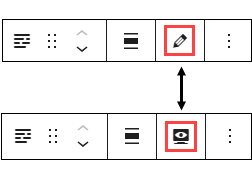
- Note: To move your block text fields from the narrow right column to the middle of your editor, go to the block’s toolbar and click on the pencil icon. This will move the fields to the middle of the page. If you want to preview the page as you are building it, click on the monitor icon and the text fields will move back to the right side of the editor. You can toggle between these two options.

Content Fields
- Title: Content entered here will appear as the Tab block’s primary title.
- Tabs: The first Tab is displayed by default. If there are more tabs in the block than will fit horizontally on a display, a scroll bar will appear below. However, the design works best with a maximum of five tabs. After you complete the content entry for the first Tab, click on the “Add Tab” button on the bottom right of the section to add more tabs.
- Tab Title: This is the label (or “Tab header”) that is displayed to the user in the Tab on the screen. Keep this short for design purposes (so small portrait-oriented screens, such as a smartphone, can display more than one tab label at a time).
- Tab Label: This field is used to generate anchors for each tab. The block will not function properly if this field is left blank (instead, all tabs will display the first tab’s content!) In theory, this field can have any value as long as it is not left blank. But for simplicity, please keep the value of this field the same as the Tab Title field.
- Content Columns: This is where you enter the content for your Tab. Each Tab has it’s own “Content Columns” set of fields. Each Tab can have up to three columns of content within it. A default of one content column is present when the block is created. There is an Add Column button to add more. Keep in mind that multiple columns of content may not display well on a mobile device held in portrait mode. We recommend restating the Tab Label as a heading level 3 (H3) at the top of the content column content for each column used. This provides some additional structure on the page for users.
Settings Fields
- Custom Language: The default language is English. Language options that will generate markup signifying that content as being in the selected language.
- Heading Size: The block title will appear on the page as an H2 heading. Do not change this to an H1 heading unless otherwise directed.
- Add Top Padding: Defaults to Yes to display the standard empty space above your block. You can change the field to No if you want less empty space, but the recommendation is to leave it set to Yes because it’s better for accessibility.
- Add Bottom Padding: Defaults to Yes to display the standard empty space below your block. You can change the field to No if you want less empty space, but the recommendation is to leave it set to Yes because it’s better for accessibility.
Example Tabs Block
This is the content on the first tab. Tabs can be a great way to provide different pieces of information about a similar topic.
This is the content on the second tab. Tabs can be a flexible way to add web content, but remember not to use tabs as navigation. Consider putting unrelated or critical content on its own page.
This is the content on the third tab.