The FAQs Theme block supports creating a list of sections, with title and content pieces that are searchable. Jump links for sections appear as a vertical menu on the right-side of the display, and the block has its very own search field to allow users to search for info in the content.
FYI — the FAQs Block was previously know as the Categorized Searchable List Panel.
FAQs Block Guidelines
- Use for Frequently Asked Questions (FAQs).
- Use for long lists of related content and details that need to be categorized and searchable.
- The FAQs block is intended for FAQs or similar content and is not for use with regular page content. If headings and paragraph text can do the job, don’t use the FAQs block.
- Follow all Image and Media Requirements and Best Practices.
- There is a limit of 100 sections.
- Only one FAQs block should be used per page. Adding more than one introduces accessibility errors to the page.
- Review the Recommendations for Accessible Theme Blocks page to learn more about requirements for headings, images, links, and media published in this panel.
- Use of this block for an undocumented purpose or in a non-standard way is discouraged and may not be supported.
How to Configure the FAQs Block
- In the page editor, click on the blue box with the plus sign located at the top left of the page. The alternative text for this link is called “toggle block inserter”. This will open a menu of available blocks to select from.

- A list of blocks sorted into 6 groups will be displayed. Scroll down to the group called THEME and click on the block called FAQs. This will add the block to your page.
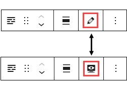
- Each block comes with its own toolbar that appears on top of the block. The buttons change depending on the block you are editing. This is what the FAQs toolbar looks like:

- Note: To move your block content fields from the narrow right column to the middle of your editor, go to the block’s toolbar and click on the pencil icon. This will move the fields to the middle of the page. If you want to preview the page as you are building it, click on the monitor icon and the text fields will move back to the right side of the editor. You can toggle between these two options.

Content Fields
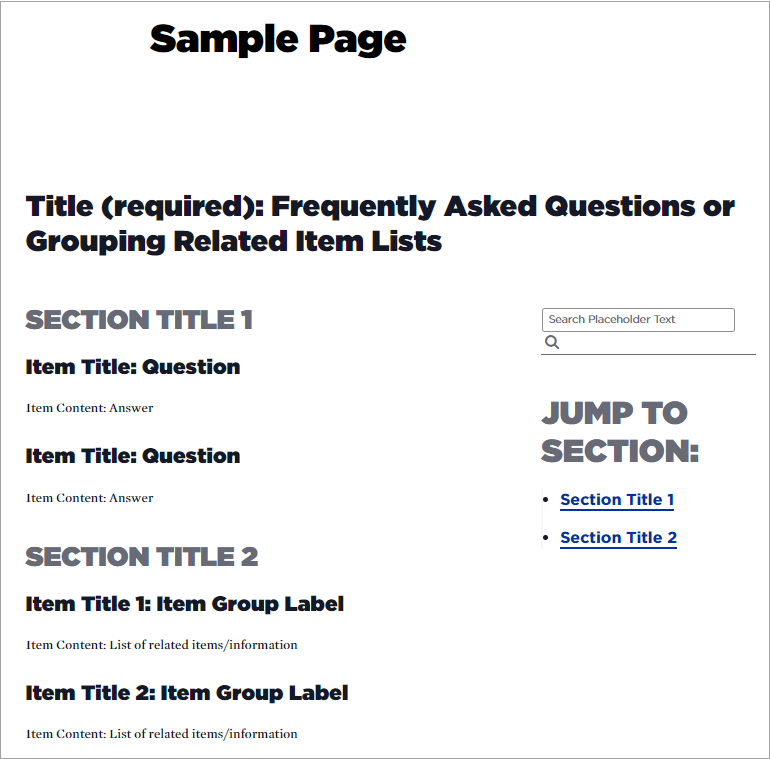
- Title (required): This is a content field. The title field will appear as the title for your block (e.g., “Frequently Asked Questions”) in large bold type. Do not leave this field blank.
- Search Placeholder Text: The default content for the field says “Search this content”. These are the words that appear above your search field. You can edit this text as needed to make it more relevant.
- Sections: A section is a container that includes a section title and one or more list items. You can create one section with a list of items, or add additional sections to group similar topics or list items together.
- Section Title (required): Content entered here will appear as the title for the current section of the list, and will appear as a “jump menu” item on the right-side of the page. Do no leave blank.
- Item Title and Item Content: If you are creating a list of questions and answers, your question would go in the Item Title field and the answer goes in the Item Content field. If you have groups of list items, you can give your item group a title. Here is a screenshot of a sample page layout using the FAQs block. It displays an outline of where the fields will show up on your page.

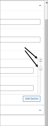
- Remove a Section or Section Row: If you want to remove a section or a section row, look to the right side of the section, move your cursor over the vertical bar for the section/row you want to remove, and a plus and minus sign will appear. Clicking on the plus sign will add another section row and clicking on the minus sign will remove the section row (and all the associated nested fields for that section).

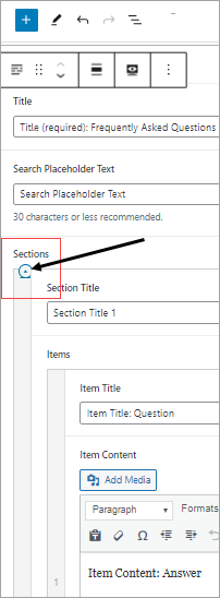
Tip: Sometimes it it hard to identify which section/row to delete because there is so much nested content. To collapse a section, look to the left outer edge of the page editor where there is a vertical bar that denotes sections 1, 2, 3, etc. Move your mouse to the top of the outermost vertical bar, hover over the bar and an icon below the word “sections” will appear (alt text Click to Toggle). Click on the icon and the section will collapse. If you collapse all sections you can look at each section one at a time. To expand the section again, simply click on the same icon and the nested fields will display.

Settings Fields
- Custom Language: The default language is English. Language options will generate markup signifying that content as being in the selected language.
- Heading Size: The block title will appear on the page as H2. Do not change this to H1 unless otherwise directed.
- Add Top Padding: Defaults to Yes, which means there is the standard empty space above the block. You can change the setting to No if you want less empty space, but the recommendation is to leave it set to Yes.
- Add Bottom Padding: Defaults to Yes, which means there is the standard empty space below the block. You can change the setting to No if you want less empty space, but the recommendation is to leave it set to Yes.
Example FAQs Theme Block
To view an example FAQs Theme Block, please see the Webguide FAQ page.