The Content Columns Theme block was formerly known as the WYSIWYG panel in the previous version of WordPress. Best practices for the use of Content Columns are as follows:
- Use for simple unordered/ordered lists or lists of links.
- Use for content that doesn’t fit into other blocks
- Use when you need content to appear in columns.
- Note: Please do not insert regular Gutenberg blocks (for example, the Details block) into any Theme blocks. Theme blocks are custom blocks created to provide specific layouts. If regular Gutenberg blocks are inserted into Theme blocks issues with accessibility and page responsiveness are encountered.
- Follow all Image and Media Requirements and Best Practices.
- Review the Recommendations for Accessible Theme Blocks page to learn more about requirements for headings, images, links, and media published in this panel.
Use of this block for an undocumented purpose or in a non-standard way is discouraged and may not be supported.
How to Configure the Content Column Block
- In the page editor, click on the blue box with the plus sign located at the top left of the page. The alternative text for this link is called “toggle block inserter”. This will open a menu of available blocks to select from.

- A list of blocks sorted into 6 groups will be displayed. Scroll down to the group called THEME and click on the block called Content Columns. This will add the block to your page.
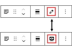
- Each block comes with its own toolbar that appears after the block is added. Some of the functionality on the toolbar changes depending on the block you are editing. This is what the Content Columns toolbar looks like:

- Note: To move your block content entry fields from the narrow right column to the middle of the editor, go to the block’s toolbar and click on the pencil icon. This will move the block fields to the middle of the page. If you want to preview your page as you are building it, click on the monitor icon and the block fields will move back to the right side of the editor. You can toggle between these two options.

Content Fields
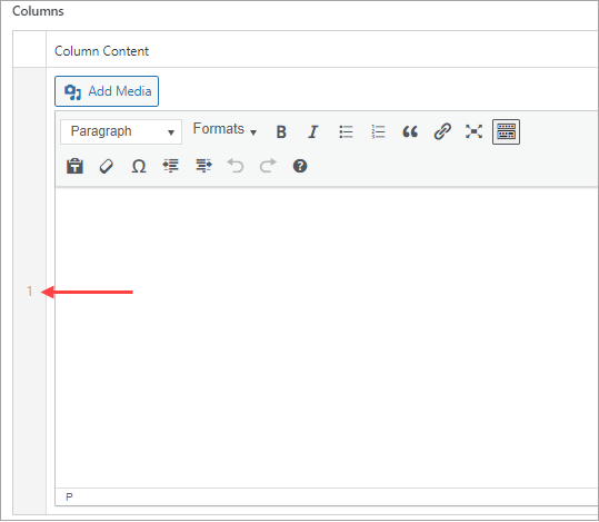
A default of one column is present when a block is created. Click “add column” for the content fields to display for column 2. You can add a maximum of three columns.
- Title: This is a content field. Content entered here will appear as the content column block header.
- Description: This is a text field. It will display next to the title and above the column content. This description should be kept brief for design purposes.
- Add Column: Click Add Column below the Description Field (bottom right). This is a content field. If you’re using more than one column, keep your column content brief for design purposes. When a column is added it is assigned a number displayed vertically to the left of the column content field.

Setting Fields
- Display Column Borders: This is a Yes/No field. The default for the field is No. When checked, a left border is displayed next to Column content.
- How to Display Description Field: This is a formatting option. When “Inline” is selected the block title will appear inline and to the left of the description content. When “Stacked” is selected, the block title will appear above and left justified with the description content.
- Heading Size: The block title will appear on the page as an H2. Do not change this to H1 unless otherwise directed.
- Add Top Padding: Defaults to Yes, which means there is standard empty space above the block. You can change it to No if you want less empty space, but the recommendation is to leave it set to Yes.
- Add Bottom Padding: Defaults to Yes, which means there is standard empty space below the block. You can change it to No if you want less empty space, but the recommendation is to leave it set to Yes.
Example of a Content Column Display (Stacked)
Title of Content Column Block
This is the description for the Content Column Theme Block. Keep this content brief.
Use this block to create columns of information on a page.
Remember that you can also utilize the WordPress Heading and Paragraph blocks to add basic web content to your page.
This block can have up to three columns.