Images convey information, demonstrate concepts, and add visual appeal to your web pages. Images can also help make complex topics or steps in a long process easier for some users to understand.
However, if text descriptions aren’t provided on your images then many users can’t access the information in the image at all while others may struggle to understand the full meaning. In this demonstration you will learn how to provide meaningful text descriptions for users with assistive technology like a screen reader.
Note: Although some studies do exist on the topic of visuals and memory, the example graphic is for demonstration purposes only and doesn’t reference any specific research. To learn more about the topic read, What makes an image memorable?
Common barriers with images
There are several ways images present barriers to accessing information. In this post we discuss three of the most common: no text descriptions, inaccurate text descriptions, and complex descriptions.
1. No Text Descriptions
Images that are not described in a textual way are invisible to non-visual users. They may not even be aware an image is present on the page let alone what the image is communicating. Images require an alternative text description either through the alt text attribute or as a long description on the page itself.
Example image with no alternative text description

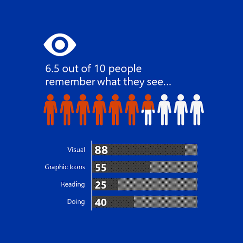
This example image is an infographic and contains information the reader is meant to read and understand. However, there is no alternative text description making the image invisible for non-visual users. Additionally, if image doesn’t load for any reason, no one will know the image is on the page.
2. Inaccurate Text Descriptions
Images that do contain an alternative text description in the alt text attribute are readable by non-visual users. However, if the description is inaccurate, incomplete, or confusing, then it’s not helpful at all.
Image descriptions must be accurate and convey the purpose and function of the image. In other words, the alternative text description tells the user why the image matters.
Example image with inaccurate alternative text description

In this example, the same infographic image has an alternative text description but it says “infographic image.” This alerts non-visual users that there is an image, but it doesn’t provide any useful information or convey the content within the infographic.
3. Complex Text Descriptions
Text descriptions that explain every single detail of the image within the alt text attribute are helpful, but can be more difficult to understand when presented as alt text.
If the image is complex enough, include a concise description in the alt text attribute and direct users where to find the more user friendly long description whether it’s on the page or linked on a separate webpage.
Example image with complex alternative text description

In this example, we have the same infographic image with a longer, more detailed description that says, “infographic image with a square blue background and a white icon of eye followed by the text 6.5 out of 10 people remember what they see. Underneath the text are 10 icons of people with 6.5 of the icons filled with orange color and 4.5 of the icons filled with white color representing the 6.5 out of 10 people who remember what they see. Below the icons of the people is a bar graph with four entries that says visual 88, graphic icons, 55, reading 25, doing 40. Graphs have patterned fill, with gray and black dots representing the number of results followed by a gray and white checkerboard pattern.”
The description is detailed and accurate but when presented as alternative text, non-visual users don’t always have the option to pause or explore the description at their own pace. Instead the screen reader often reads out the alternative text as one long stream of consciousness.
Having a long text description on the page or on a separate page provides more flexibility for users to read at their own pace.
How can we make this image more accessible?
For our infographic example, it’s not decorative because it is conveying information. It’s also not simple enough to convey in a short description using the alt text attribute.
Here’s how we can make this information more accessible and usable for all users.
- Add a heading to alert users what’s in the section that contains the image
- Provide a short alt text description that tells users where to find the full text description
- Add full text description to page with any additional context for all users to review
Here is an example of the image using the Text + Image panel.
Visuals help people remember information
Our research indicates 6.5 out of 10 people remember what they see. When 208 survey participants were asked how they best remember information:
- 88 reported visuals
- 55 reported graphic icons
- 25 reported reading
- 40 reported doing
This research indicates visuals can help improve memory retention for some users and can be used in conjunction with other methods like text descriptions, graphical icons, and demonstrations.
Three tips to make your next images more accessible
1. Decoration
According to the World Wide Web Consortium (W3C) Web Accessibility Initiative (WAI), an image is considered decoration when it doesn’t “add information to the content of a page. For example, the information provided by the image might already be given using adjacent text, or the image might be included to make the website more visually attractive.”
For more information on decorative images including examples see W3C WAI: Decorative Images.
2. Nice to Have
An image is nice to have when it conveys information to the user. The W3C WAI, “Informative images convey a simple concept or information that can be expressed in a short phrase or sentence.”
To learn more about these types of images, see W3C WAI: Informative Images.
3. Essential
Unlike decorative or informative images, images are essential when they convey information that is required for users to understand a concept, complete an action, or contain text that is meant to be read. The W3C WAI provides additional descriptions and examples of these types of images.
Questions?
If you’d like to learn more about writing image descriptions, check out the resources available on Webguide: Accessibility Resources and Guides. You can also reach out to the OIT Accessibility Team at OITAccessibility@boisestat.edu.