Boise State provides specific values for using university colors in print, digital and embroidered media.
For university websites and other online media, combinations of these university colors may pose difficulties for viewers who have color vision issues. 1 in 12 men and 1 in 200 women have color blindness; that’s ~1,060 faculty, staff, and students at Boise State.
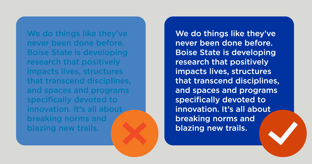
These issues are particularly apparent when viewing colored text against a colored background.
Know Your Contrast Ratio
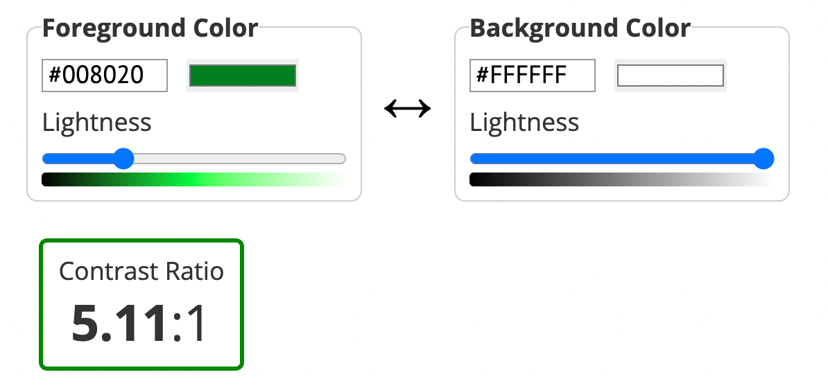
We can eliminate most color vision hurdles by ensuring the contrast ratio of text against a background is at least 4.5:1 for normal text, and 3:1 for large text.
In general, this means that text against a dark background needs to be very light, and text against a light background must be very dark.
The good folks at WebAIM offers a simple online resource to validate your colors for contrast requirements. Input both the hex values of your text and background colors (you can find these in your image editor or on the university’s Brand Standards site) to find your contrast ratio:
Avoid Blue on Orange
Most color contrast issues we see at Boise State involve blue text against an orange background, or vice-versa.
We love our blue and orange, but they weren’t designed to be used together as foreground text against a colored background.
When standard Boise State blue text is used against a standard Boise State orange background, the contrast ratio is 2.35:1. (The same is true for orange text on a blue background.) This ratio doesn’t meet the required minimums for both normal and large text.
So, if you want that vast majority of people to be able to read your text, avoid the blue and orange combo!
More Information
You can learn more about using Boise State colors with your digital projects by visiting the Office of Communications and Marketing’s website.