Email Standards and Guidelines
Email Templates
The Office of Communications and Marketing has provided three basic templates within the Shared Content Library for your use in Salesforce Marketing Cloud, including:
- Event invitation
- Letter
- Newsletter
The Shared Library also includes the following creative assets:
- Logos
- Headers and footers
- Buttons
- Text blocks
Accessibility in Email Marketing
What does it mean?
Accessibility means a person with a disability is afforded the opportunity to acquire the same information, engage in the same interactions and enjoy the same services as a person without a disability in an equally effective and equally inclusive manner with substantially equivalent ease of use.
Accessibility guidelines as they relate to email marketing can be found throughout each section of this page, but it is best to first review Boise State’s web accessibility resources here. You can also watch a helpful video providing Tools for Digital Accessibility. If you have questions about accessibility on the web or in email, contact the OIT Web Accessibility Team at OITAccessibility@boisestate.edu.
Fonts and Typography
Use Arial or Arial Black as sans serif font alternatives and Georgia as a serif font alternative for email communications. These most closely align with our brand and are designated as “web-safe,” meaning they will appear as-is when received by most, if not all, email clients, including Outlook.
Boise State’s official fonts – Gotham and Garamond – are not web safe and will not consistently load across all email clients. Using Arial and Georgia as alternative, web safe fonts ensures consistency and removes the risk of email marketing communications loading incorrectly.
Do not use images of text when you can use plain text to convey the same information. Images of text are not accessible and do not meet WCAG 2.x Level AA Conformance. Adding alternative text is not enough.
Brand-compliant headers are included in the Shared Library and in approved email templates. Boise State’s signature mark must always be used in headers.
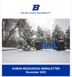
Business unit or department-specific logos (companion marks) are not permitted in email marketing communications. Section headers are the preferred alternative to companion marks and can be found in the Shared Library’s Content Block folder under “Text”. Below is an example of a section header being used at the beginning of a Human Resources newsletter template.
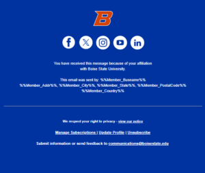
A brand-compliant footer is also available in the Shared Library complete with social media icons that can be customized with links to either Boise State’s enterprise-level social media accounts or college/business unit accounts. This footer also includes information required by the CAN-SPAM Act.
Text
- When possible, copy should be left-aligned and no less than 16 px, to aid in accessibility.
- Use proper headings structure. Headings should act as an outline for the content of the email. Your readers will scan the headings to find out what the email is about. It is critical to keep headings in order and not skip heading levels.
- Use descriptive, distinct text for buttons and hyperlinks. Never use link text that says things like “read more” or “click here.” Text on buttons and hyperlinks needs to be descriptive enough to signal to the user what they are going to find when they select the link.
- PDFs as attachments are not accessible and should not be used.
Template Background Color and Contrast
*This section refers to approved colors for template backgrounds (the color that populates around the main content of your email). Content block/layout background colors should always be selected with your template background in mind.
The background color of any template created in Salesforce Marketing Cloud should reflect Boise State’s brand and use only one of these approved colors:

- Lightest gray = #F6F7F9
- Blue = #0033AO
- White = FFFFFF
It should be noted that the three approved templates in the Shared library use Boise State’s lightest gray as the template background color.
Using Boise State’s official color palette in all email communications is the best way to ensure you are avoiding any issues with color contrast. Otherwise, it is always good practice to be cognizant of using accessible colors in your email communications. Here are a few tools OIT recommends to determine if your colors have enough contrast:
Image Accessibility
- Images of text are not accessible and do not meet WCAG 2.x Level AA Conformance. Do not use images of text when you can use plain text to convey the same information. Adding alternative text is not enough.
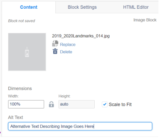
- Images require descriptive alternative text. Alternative text describes images for users who cannot see them and is read by screen readers or displayed on the screen when the image is not available to users. Alternative text does not need to describe every element in an image, but rather provide a short, concise, description of either the content, or the function.
- Inserting alt text can be done by simply inserting a brief image description in the “Alt Text” field while you are editing or uploading content to an image block (see example below). Be sure to do this before hitting “Done Editing”.
- Review images before sending your email to ensure they are accessible for all users.
- Complex images such as screen captures for documentation, data and graphs, organizational charts, infographics, flowcharts and diagrams should have a text equivalent within the email to fully describe the meaning of the image.
Boise State’s Campus Map provides a text alternative for map locations. For all campus locations, you should include a map view from the Campus Map to display maps.
Image Sizing
- Refer to the Boise State web guidelines regarding images and media for best practices when using photos and graphics in digital marketing.
- Ensure images are scaled to the exact size you want them to appear when uploading.
- Hero images should be no larger than 600 pixels wide.
- Depending on the number of images you are using side-by-side, divide 600 pixels by the number of images and resize them each accordingly (i.e. using two side-by-side images should be no larger than 300 pixels wide each, using three images across, each image should be no larger than 200 pixels wide).
- Images must be smaller than 2MB to upload to Marketing Cloud, otherwise, the file upload will error. Help your readers with slower internet speeds by reducing the file size of your images to less than 1MB.
- Make sure your content can be consumed and understood without images. Images aren’t always on by default, especially for audiences using Outlook.
Videos
- Images of text are not accessible and do not meet WCAG 2.x Level AA Conformance. Do not use images of text when you can use plain text to convey the same information. Adding alternative text is not enough.
- Images require descriptive alternative text. Alternative text describes images for users who cannot see them and is read by screen readers or displayed on the screen when the image is not available to users. Alternative text does not need to describe every element in an image, but rather provide a short, concise, description of either the content, or the function.
- Inserting alt text can be done by simply inserting a brief image description in the “Alt Text” field while you are editing or uploading content to an image block (see example below). Be sure to do this before hitting “Done Editing”.

- Review images before sending your email to ensure they are accessible for all users.
- Complex images such as screen captures for documentation, data and graphs, organizational charts, infographics, flowcharts and diagrams should have a text equivalent within the email to fully describe the meaning of the image.
Boise State’s Campus Map provides a text alternative for map locations. For all campus locations, you should include a map view from the Campus Map to display maps.
Optimizing for Mobile
A large portion of your audience may be accessing your content on a mobile device. Marketing Cloud allows you to test your emails within Content Builder and Email Studio across multiple email clients and on mobile devices before sending to your audience. Be sure to use this functionality to see how your email will appear to recipients using various email clients on desktop and mobile devices.
Writing for Email – Best Practices
Boise State follows Associated Press guidelines in publications and digital marketing efforts except where indicated in the University Writing Style Guide. See below for nuances specific to writing for email marketing efforts.
Always reflect Boise State’s brand
The content of your email should reinforce Boise State’s mission and brand. See Boise State’s brand guidelines for more information.
Keep it brief
Emails should usually be brief and include links to more information or a call to action. People scan email on a variety of devices, so keep paragraphs short and use bullets and headlines to highlight important information and quickly convey points.
Be consistent
Refer to programs, events or actions you wish the recipient to take in the same way within each email. If you create multiple emails within a campaign, you should talk about these concepts in the same way across all emails.
Keep subject lines clear and concise
Readers often decide whether to open an email based on the subject line. Some things to consider when creating your subject line:
- Keep your subject line straightforward. Avoid ambiguity and word plays.
- Limit your subject line to about 50 characters.
- Be transparent about your intentions. Avoid “tricking” recipients into opening your email.
- Do not use “Blue Turf Thinking” or “This is Blue Turf Thinking” in reference to the content of the email.
Avoid jargon
Use the same language your readers would use. Explain terms that are familiar to you but that your readers may be seeing for the first time.
Use spelling and grammar-check wisely
While spelling and grammar checks can help you spot mistakes, remember that these do not know what you are trying to say nor do they follow Boise State’s style. Review each suggested correction before you make the change.
Test all emails before sending
Always test your email before a mass mailing. View the email through several different web browsers and clients (Outlook, Gmail, etc.) to make sure there are no formatting errors or unrecognizable characters. Create a test data extension within Marketing Cloud that includes designated Quality Assurance (QA) tests with various email domains and devices. Salesforce recommends using this checklist for email campaigns:
- The subject line and preheader are correct
- Email is using the correct header and footer
- Email is using the correct template
- No typos or grammatical errors
- All images render correctly
- Email uses inclusive marketing principles
- All links work, have alias tags set and go to the correct location
- ALT text is set and does not include any spelling/grammatical errors
- All required legal copy is present
- Unsubscribe link is correct and present (unless transactional)
- Text version is correct
- All dynamic elements are functioning properly (if applicable)