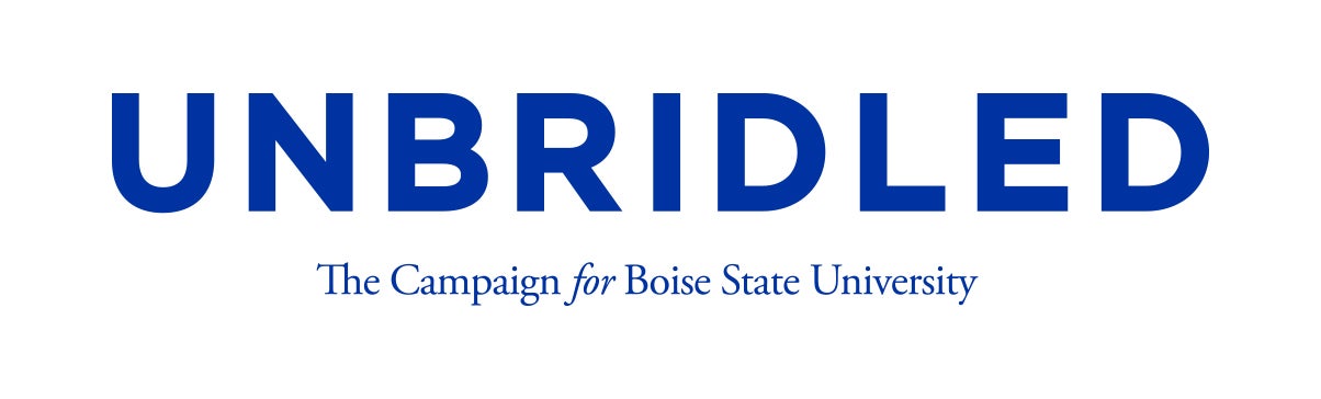
Using the correct logo is very important when creating well-branded materials. The Unbridled wordmark consists of the word “UNBRIDLED” in Gotham with the words “The Campaign for Boise State University” beneath in Garamond. This wordmark should only be replicated using the files provided as special kerning (the spacing between individual letters or characters) has been used to create it. The Unbridled wordmark files can be accessed in the Unbridled Campaign Google Drive. Click here to request access to this drive.
The Unbridled Wordmark is singular, strong and easily identifiable. Consistent usage helps make the Unbridled Wordmark a readily recognizable, compelling symbol that audiences can identify Boise State with. The Wordmark must always be accompanied by a Boise State University logo. More on this requirement is outlined as follows:
Guidelines
Wordmark Color Palette
The Unbridled Wordmark should be presented in either the Boise State blue or white. Orange is reserved for the required Boise State logo and accent elements.
Using the Mark on Different Backgrounds
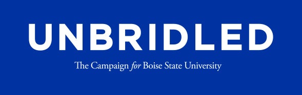
White Background
White is the preferred primary background of the Unbridled campaign. When the Unbridled Wordmark appears on a white background, it runs entirely blue.
Blue Background
When the Unbridled Wordmark appears on a blue background, it reverses to white entirely.
Orange Background
With the predominant color palette of the Unbridled campaign utilizing blue and white, the Unbridled Wordmark is to never appear on an orange background.
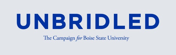
Gray Background
The Unbridled Wordmark can only appear on a light gray background. As such, it will remain blue. Dark gray backgrounds are not permitted.
Black Background
The Unbridled Wordmark is not permitted on a black background. Note: Approvals may be granted for promotional items, please email heathercarlson2@boisestate.edu for guidance.
Using the Mark on Imagery
When placing the Wordmark over a photograph or video as a large element, the placement should be in an area of the photograph where there are no distracting patterns or elements and the Wordmark is clearly legible over the image. The photograph or video should be visible through the logo, instead of creating a box of color around the logo.
Clear Space and Sizing
Clear Space
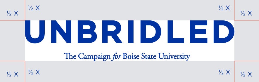
To ensure the logo is highly visible and maximizes its impact, always separate it from its surroundings – allow clear space. The minimum required clear space, surrounding all logos should be half the height of the logo on all sides as shown. No other text or graphic elements, including other logos, should be in this space. This is also the minimum distance the logo can be from the edges of a document, whether electronic or printed.
Minimum Print Reproduction
The University Signature Mark should not appear smaller than 2 inches wide by 0.6 inches tall in print unless space dictates smaller size, in which case care should be taken to ensure that the Mark is legible. If the space is small enough that it makes “The Campaign for Boise State University” difficult to read, contact Heather Carlson at heathercarlson2@boisestate.edu for direction.
Required Use of Boise State Logo
The Unbridled Wordmark must be accompanied by a Boise State logo, specifically the one-color orange primary mark or the one-color B symbol.
Location
The Boise State logo should always appear to the right of the Unbridled Wordmark (if appearing next to each other) so as not to be unintentionally read as “B Unbridled” or as a standalone logo near the top or bottom of the collateral.
Examples
Split Location: Boise State Primary Mark
Same Line: Boise State Primary Mark
Split Location: B Symbol
Same Line: B Symbol
Altering the Unbridled Wordmark
What?! No way!
- The Unbridled Wordmark may not be cropped, blurred, stretched or distorted in any way. This includes the use of shadows, outlines, filters, or any other effects. Do not change the colors of the logo.
- The Unbridled Wordmark should not be altered from its original form and cannot be adapted in any way. Alterations to the logo dilute the brand.
- The Unbridled Wordmark may not be incorporated or combined with any other mark, symbol or graphic to create a new mark.
- When using the Unbridled Wordmark, it is preferred to not separate the “Unbridled” and “The Campaign for Boise State University.” These are not individual pieces that can be used independently, but instead, together make up the Unbridled Wordmark.
Alternative Text Descriptions
The alternative text description should be “Unbridled: The Campaign for Boise State University.”
Which File Should I Use?
There are three types of files available for download in the Unbridled Campaign for Boise State Google Drive.
EPS
EPS (Encapsulated PostScript) files are created from mathematical curves and lines that stay in focus and in proportion no matter the file size. This means there is no pixelation and a graphic will look the same at 1 inch as it does at 10 feet. These files are ideal for uses from letterhead to billboards. An EPS of your graphic should be the first thing sent when it is to be designed and printed.
- Files are resizable, print worthy, and transparent
- Require Adobe Illustrator CS2+
- Should always be used for printed files
JPG
JPG is a good file type for PowerPoint presentations and other digital applications that do not demand much of an image. Like TIFFs, JPGs are pixel-based. They are also compressed and generally have a low resolution to keep the file size low. A JPG graphic may appear acceptable on screen, however, JPGs are not recommended for printing. JPGs do not support a transparent background.
PNG
PNG is another good option for digital use. Unlike JPGs, PNGs have a transparent background. They have replaced the GIF format.
- Should be used for on-screen applications, such as Microsoft Powerpoint or digital marketing.
- Should not be used for printed documents
Color Modes
The Unbridled Wordmark and Boise State one-color orange marks are available in three color modes: RGB, CMYK, and PMS.
- RGB files are used for digital screens (digital ads, presentations and videos) – never for printing.
- CMYK is for four-color printing and is not always accurate when it comes to reproducing a specific brand color.
- PMS, or Pantone Matching System, solves the accuracy issues associated with CMYK. PMS is a universally recognized color scheme to which every printing press subscribes. It is often referred to as spot colors, whereas CMYK is referred to as process.