Typography Hierarchy and Infographics
Typographic Hierarchy
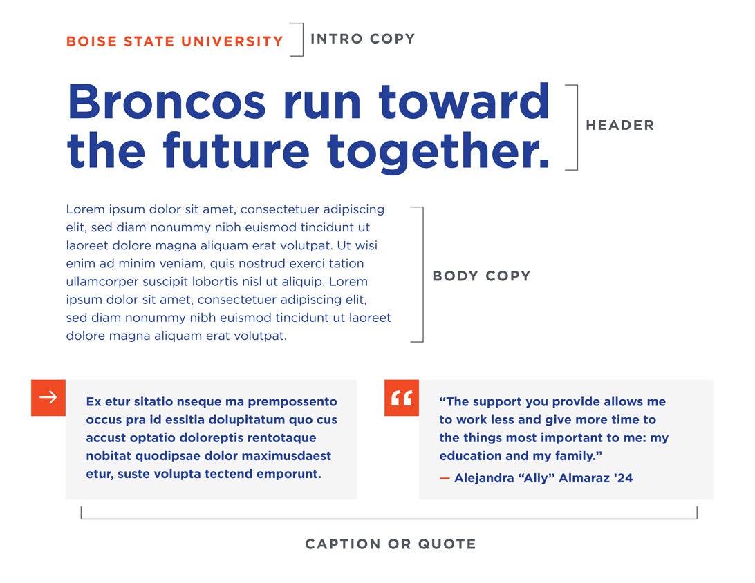
Refer to the image below for a visual representation of the following:
- Intro Copy: Orange, Gotham Bold, 18 pt (or roughly 30% the size of the header) +100 tracking (or roughly 5x the font size)
- Header: Gotham Bold, 60 pt or largest distinguishable font size
- Body Copy: Gotham Book, 15 pt or roughly 25% the size of the header (should not be smaller than 10 pt)
- Caption or Quote: Gotham Bold, 15 pt or roughly 25% the size of the header (should not be smaller than 10 pt)
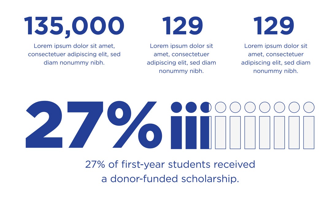
Number-Driven Infographic
- Title: Gotham Bold, 60pt
- Body: Gotham Regular, 14 pt to 24 pt depending upon location and size of infographic
- The predominant color is Pantone 286C with either the lightest gray or Pantone 172C as the accent color.
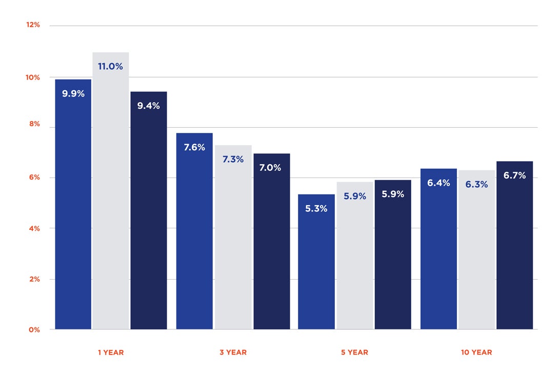
Bar Graph
All labels should be in Gotham Bold (white or Pantone 286C depending upon bar color).
Bar graph colors should be used in the following hierarchical order: Pantone 286C, lightest gray, Pantone 2757, Pantone 172C.
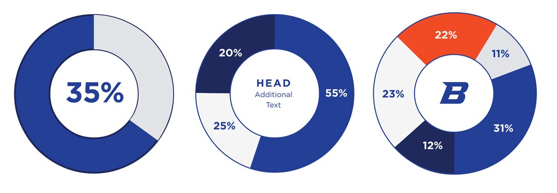
Pie Chart
- Large Label: Gotham Bold, 47 pt
- Small Label: Gotham Bold, 17 pt and Gotham Book 12 pt
Pie chart colors should be used in the following hierarchical order: Pantone 286C, lightest gray, Pantone 2757, Pantone 172C. If needed, Pantone cool gray may be used as a fifth color.
Purchasing Fonts
Purchase Gotham
The Gotham I package can be purchased at an educational discount of $35. Please contact brand@boisestate.edu to submit your request.
Convert to Gotham
If you do not have the Gotham package, Printing and Graphic Services can convert your marketing materials to Gotham for a fee. If you hire an outside designer, they will have to purchase Gotham font directly from Hoefler & Co., if they do not already have it.