Graphic Elements and Guidelines
The “Breakthrough B”
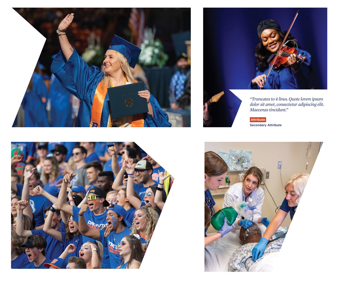
As a Photographic Element
When using the ‘Breakthrough B’, the inner angle or outer angle should be used as an overlay positioned on the left or right side of the image. It may also be used as a holding container for text/copy. To provide additional options and better fit in tighter spaces, the “B” angle can without the angular point can be used as a photographic overlay. Refer to the bottom right example.
Note: The angular point and “B” angle must always face the right side of the design (from the viewer’s perspective) to create forward momentum and an upward trajectory that is associated with Boise State’s history.
As a Background Element
The “Breakthrough B” can also be used as a watermarked background element using the lightest gray. This not only provides continuity with the use of the “Breakthrough B” in other branded materials, but it also provides a visual interest and upward trajectory in a more subtle way.
The “Breakthrough B” can fill the height of the page or fill a portion of the page. Refer to the examples below for guidance.
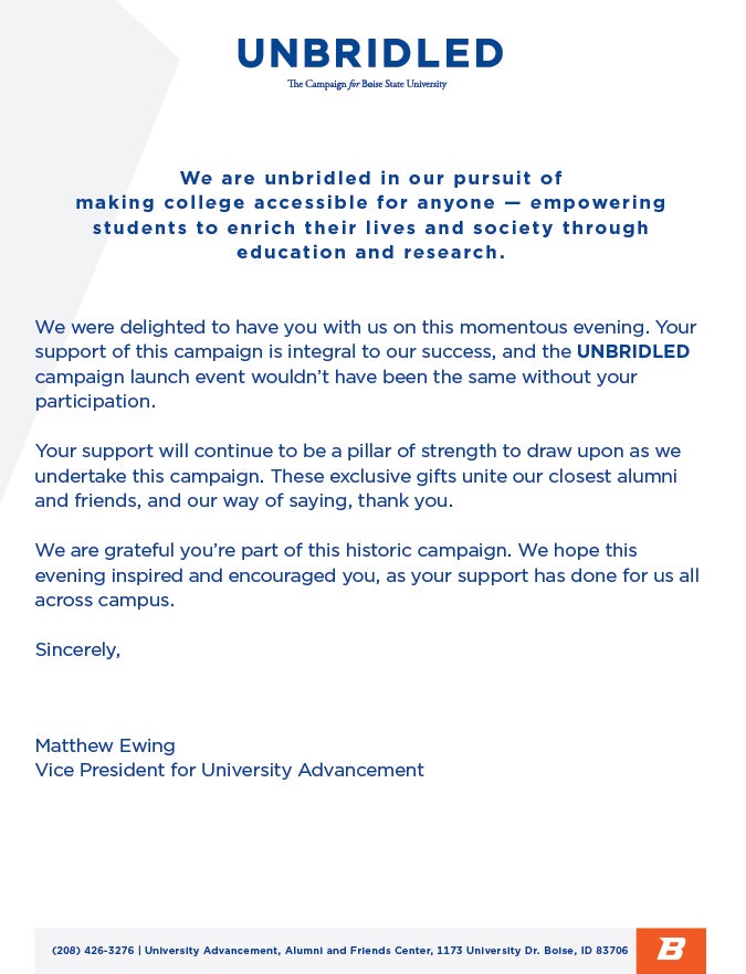
Example: Letterhead (Corner “Breakthrough B”)
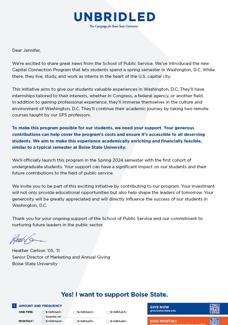
Example: Appeal Letter (Full “Breakthrough B”)
As a Linear Element
To both add pops of the bright Boise State orange and additional visual interest, the “Breakthrough B” can be utilized in a linear fashion. It is a way to tie in multi-spread layouts or to direct the eye in an intentional way across the design. It can be used as a stand-alone graphic or in conjunction with a photo or callout device.
The same rules apply with regard to keeping the angular points facing the right side of the design. These are accompanied by straight lines again indicating a forward trajectory. The “Breakthrough B” angle can be any length, but is recommended that the thickness of the stroke be minimal so as to be visible as a background element, not a featured one.
Example: Social Media Layout with Angular Box Callout
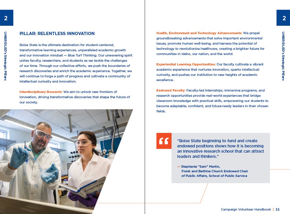
Example: Multi-spread Layout with Photo and Pull Quote Callout
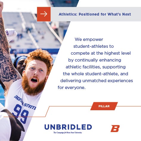
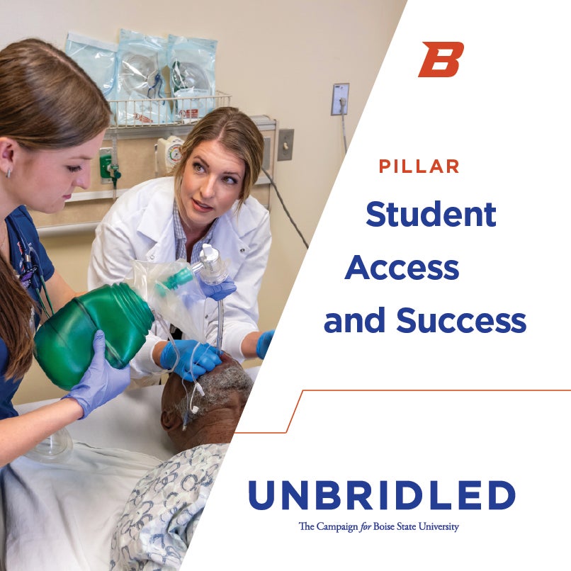
Example: Social Media with Photo
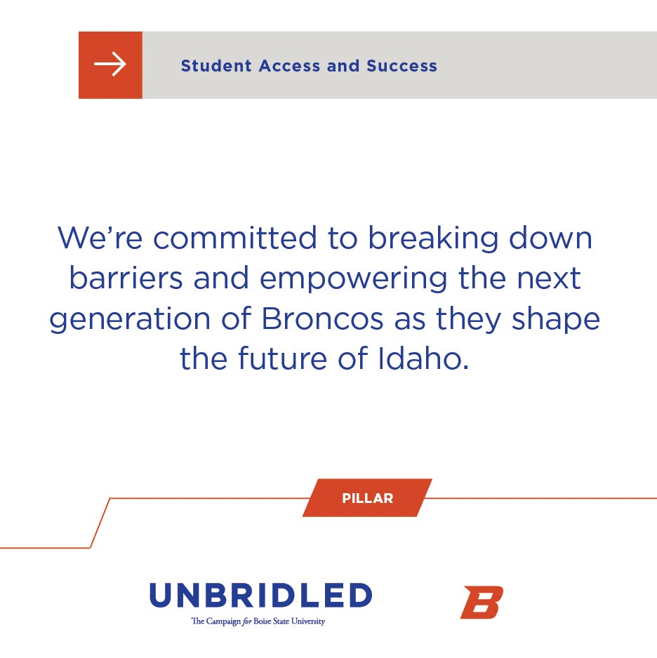
Example: Social Media with Angular Box
Callout Devices
Callout devices allow for stylized ways to give audiences a visual cue that the information is important and offset the featured content from the rest of the page.
Angled Box
The angled box is Boise State play on a standard rectangular callout device. Instead, the vertical sides angle to match the “Breakthrough B” angle. This provides a way to feature secondary headlines or important content in a uniquely Boise State way.
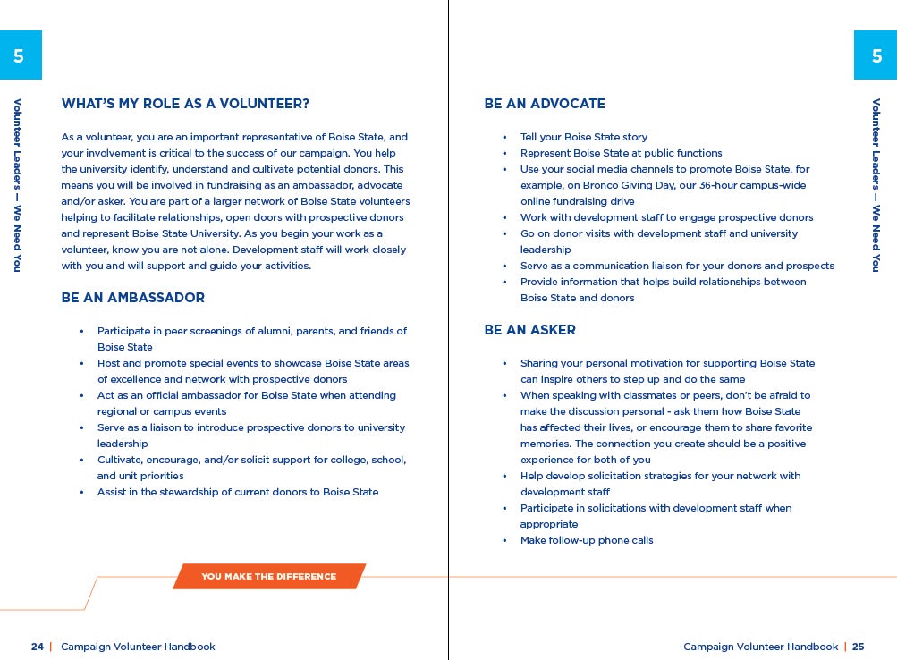
Example: Multi-page Layout emphasizing that “You (volunteers) make the difference.”
Example: Social Media Layout emphasizing that the content relates to a campaign pillar

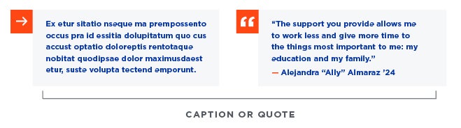
Arrows and Pull Quotes
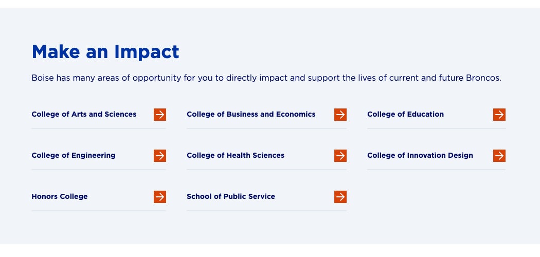
Square orange boxes, with either a slim white arrow or quotation marks, are used to direct the audience’s eye to light gray boxes holding either callout text (facts, important copy) or a pull quote.
The square orange box should be 1/3 the size of the height of the gray box. If gray box sizes differ throughout the design, pick the one that works best visually and remain consistent throughout.
Typographically, the copy within the box should be Gotham Bold, 15 pt (or roughly 25% the size of the header, but should not be smaller than 10 pt). See the example below.
The arrow can also be used to call out secondary or tertiary short content by making both the orange box and the gray box the same size and running horizontally across the design. See the example below.
Call to Action Devices
Primary or Emphasized Call to Action
In order to make the primary call to action, or emphasized call to action if there are multiple options clear and apparent a certain treatment should be applied.
The call to action should appeal in an orange box with white UPPERCASE text that clearly defines the action. Next to the text will be a right-facing slim arrow noting action.
As the campaign is focused on philanthropy, the predominant call to action will be “GIVE NOW.” However, as there are often campaign events, this could also be “REGISTER NOW” depending upon the focus and intended action for audiences to take. See the examples below.

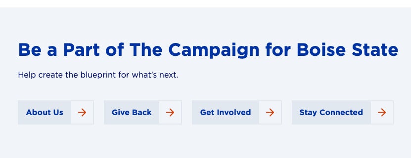
Secondary or Subtle Call to Action
Sometimes pieces will have multiple ways for audiences to engage or interact. These may not be the primary call to action, but provide a more subtle approach.
These buttons are thus softer in appearance with the lightest gray or cool gray serving as the background with Pantone 286C title case font and an orange arrow.
These can be up to four buttons maximum. Any more and it runs the risk of choice overload. When presenting two options, the buttons can be different gays. However, if using more than two, keep the colors of the buttons consistent.
Example: Two Buttons
Example: Four Buttons
If there are more than four calls to action, consider using text with small orange boxes with arrows to differentiate. See the web example below.